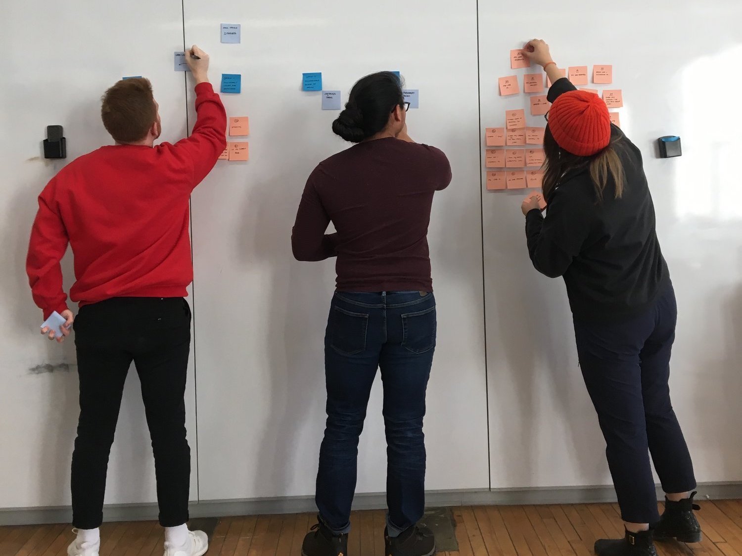
As a group myself,
Sharon Dayoung Lee,
Serina Liu,
and Robert Managad
were tasked with answering the following questions regarding the state of Design using the AIGA (The American Institute of Graphic Arts) 2017 census data and a combination of motion web and or print.
What is the state of design today?
What are the methods to analyze and visualize data?
How can designers use data beyond the purpose of information delivery?

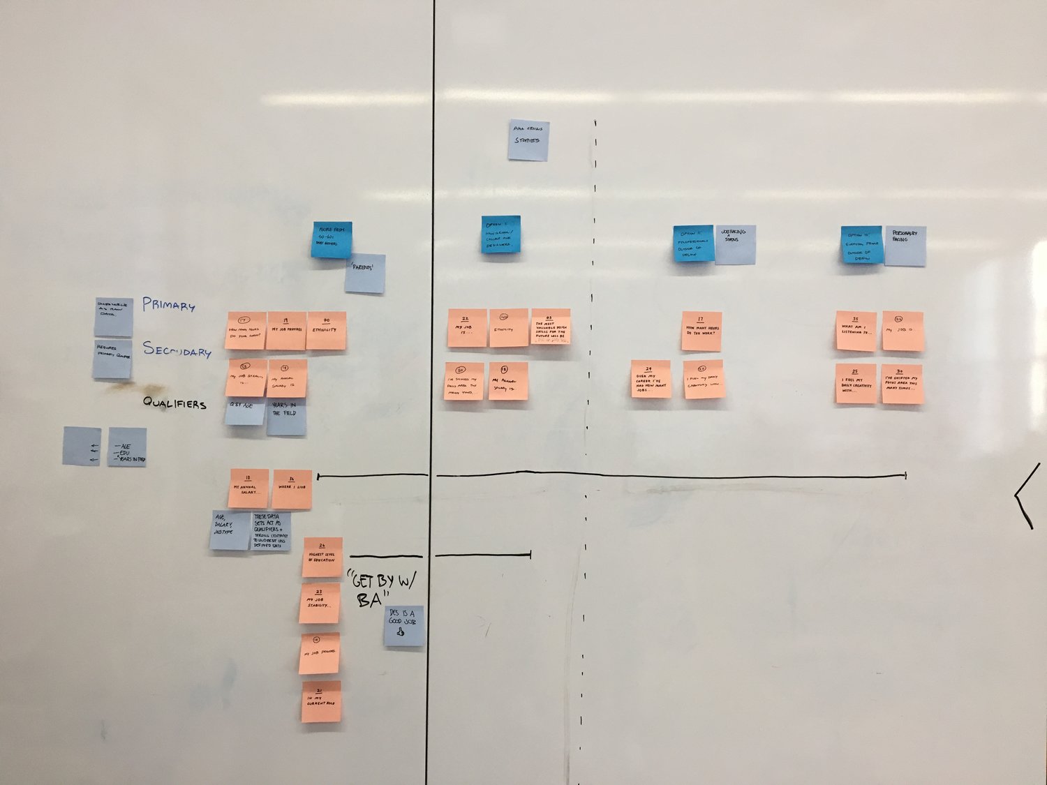
Analyzing the data 13,000+ designers submitted to AIGA in 2017 we decided how we wanted to tell their story, and who we wanted to hear that story.
"As a group of four communication design students at Carnegie Mellon University, one of our biggest pet peeves is the fact that design often gets misunderstood. Our print piece and interactive web piece are both attempts to overcome the stereotypes that are associated with design. We think every designer can relate to having to try to explain to a family member, a friend, or an outsider what design is and it's importance."
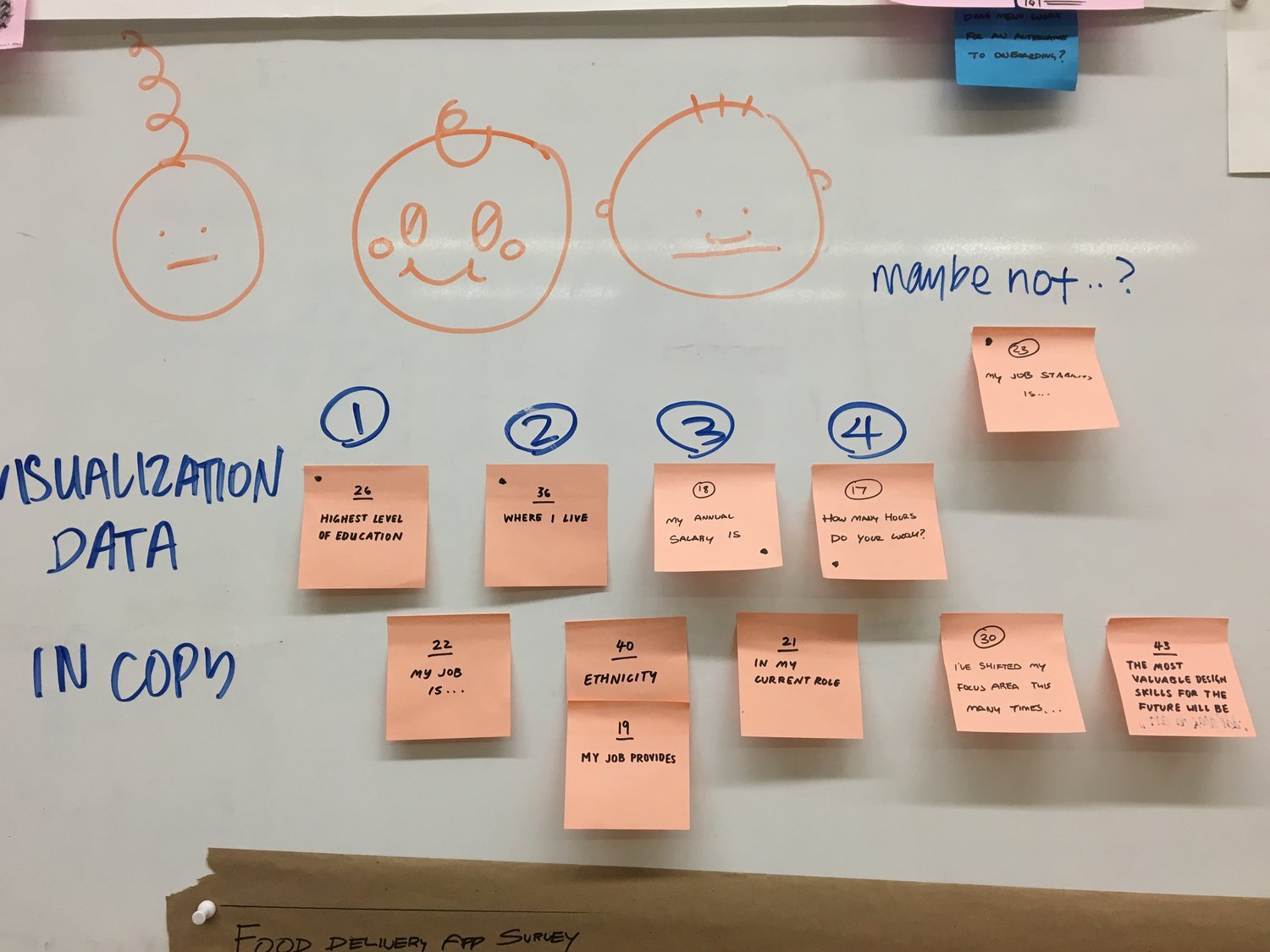
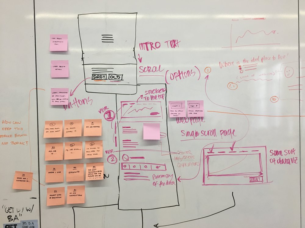
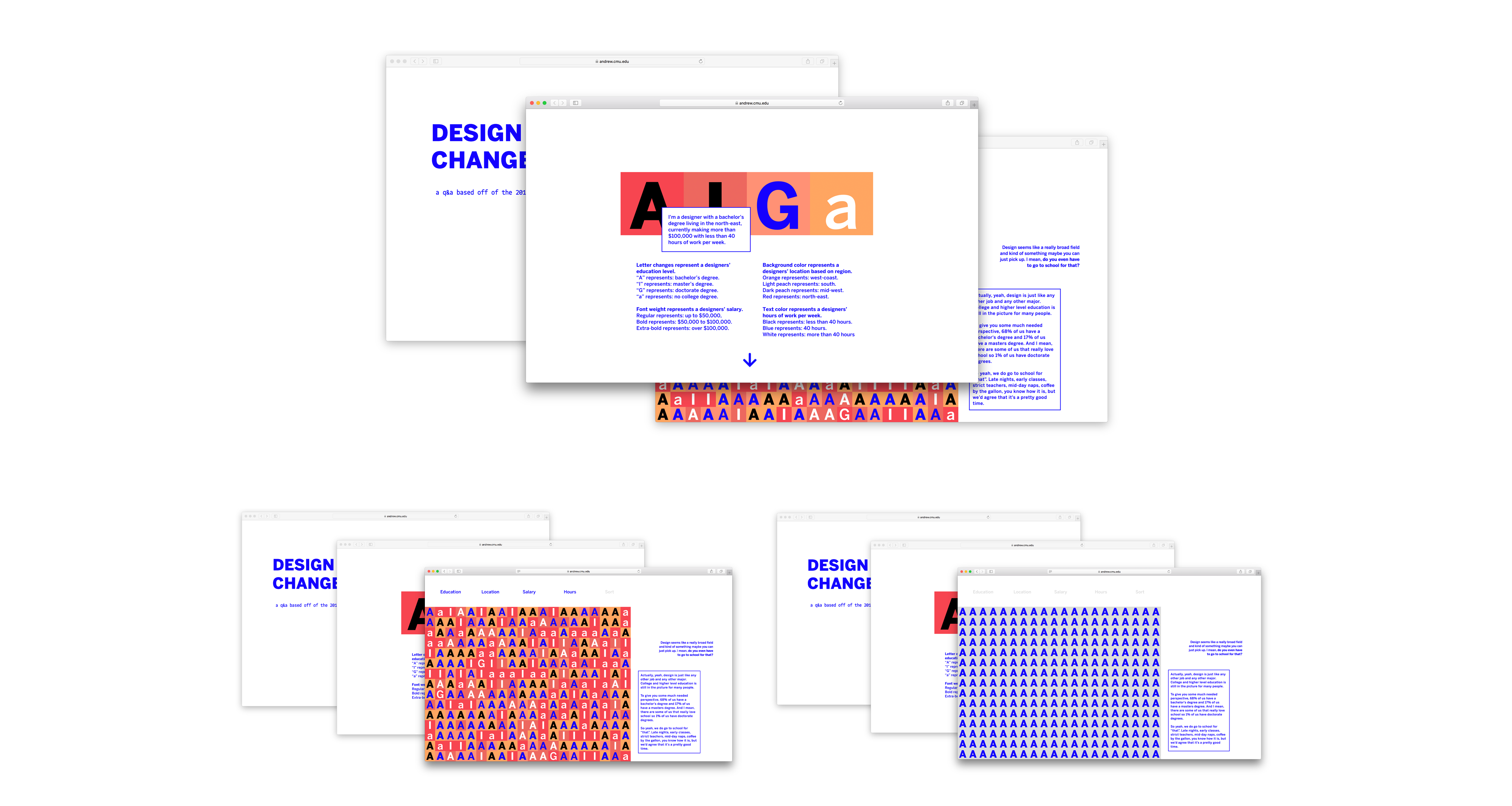
I coded an interactive data visualization experience as well as an onboarding experience to introduce the user to four pieces of data our group decided were most important to answering the posed questions and illustrating the claims we make in our copy.
1. Education.
2. Location.
3. Salary. (and)
4. Hours.
Our group worked on creating an immersive experience surrounding the interactive data visualization. We decided on walking the viewer through an onboarding experience and displaying our copy in a text-chat type experience. We expanded the experience past the coded interactive with a responsive interaction including the option to reference back to the onboarding information and added filtering options.
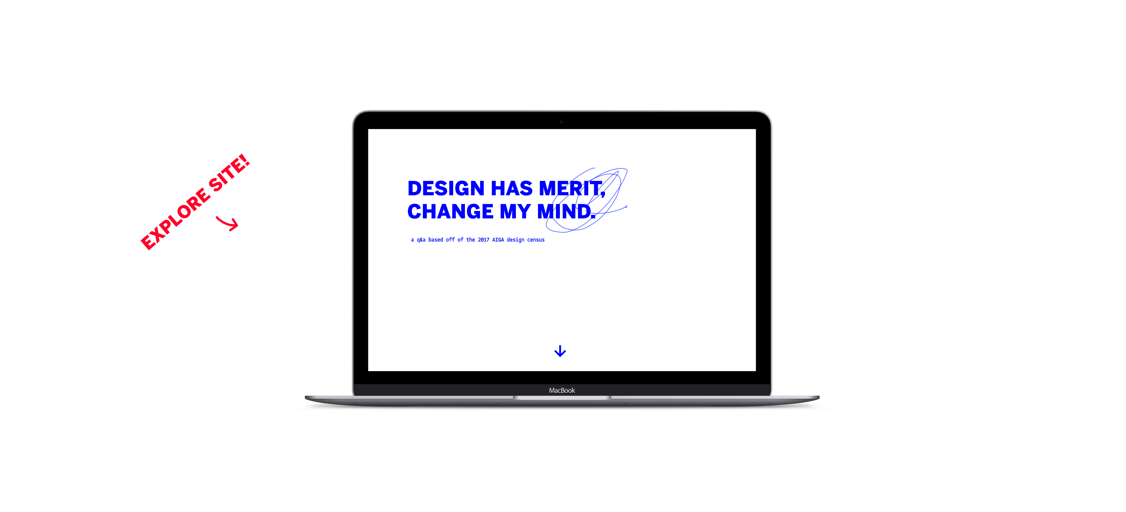
Final copy and website link. View @ 1440x900.
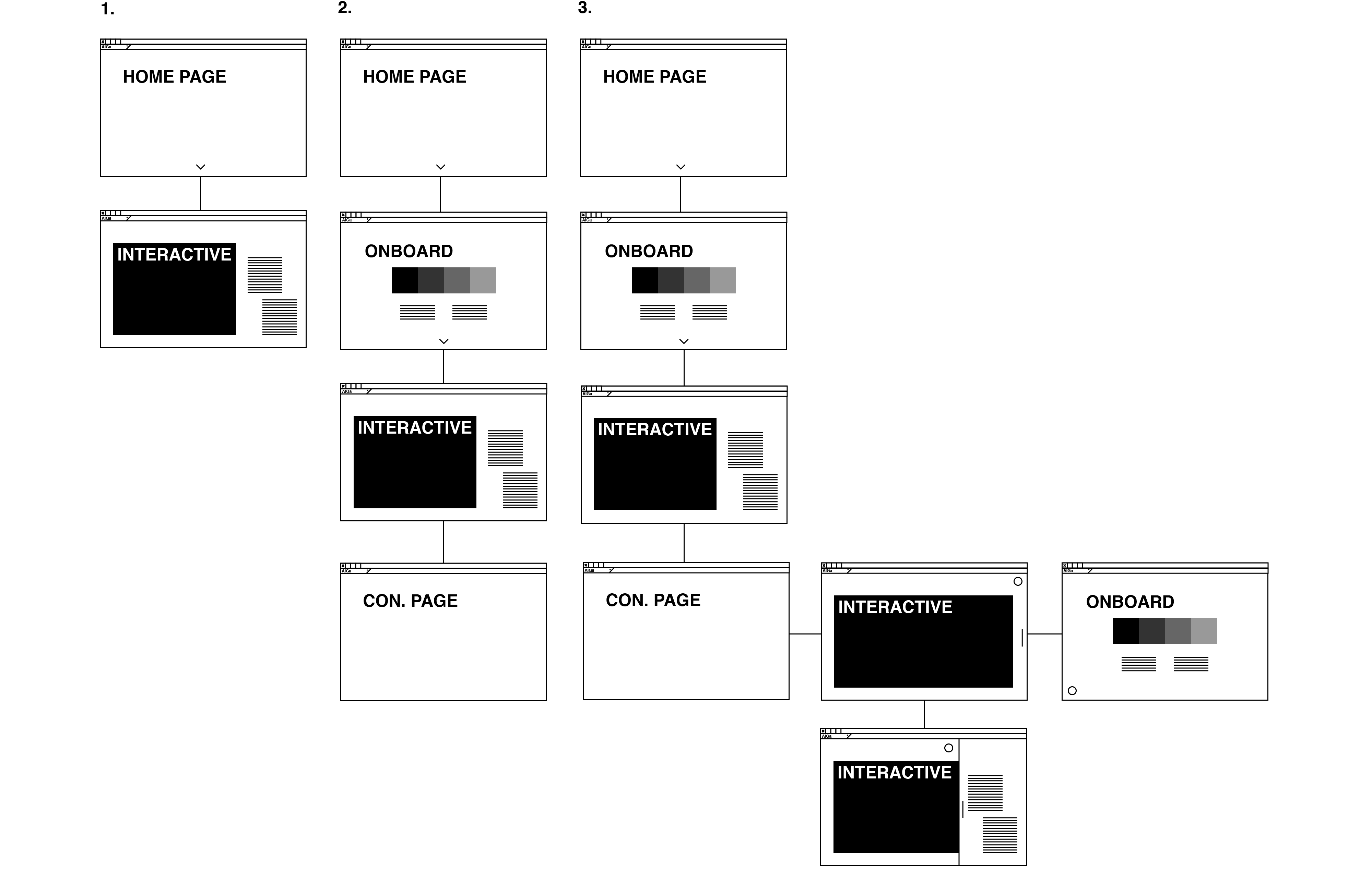
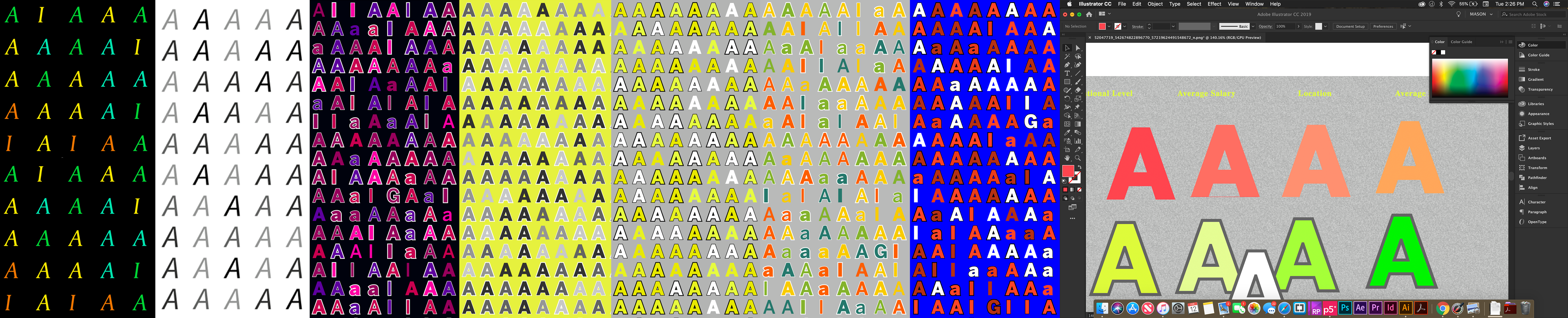
We quickly iterated and made big decisions concerning the visual system to appropriately express the voice of our project and work within the constraints of the interactive, our data visualization uses background and text colors to express data which made the color a challenging and important space within our project.
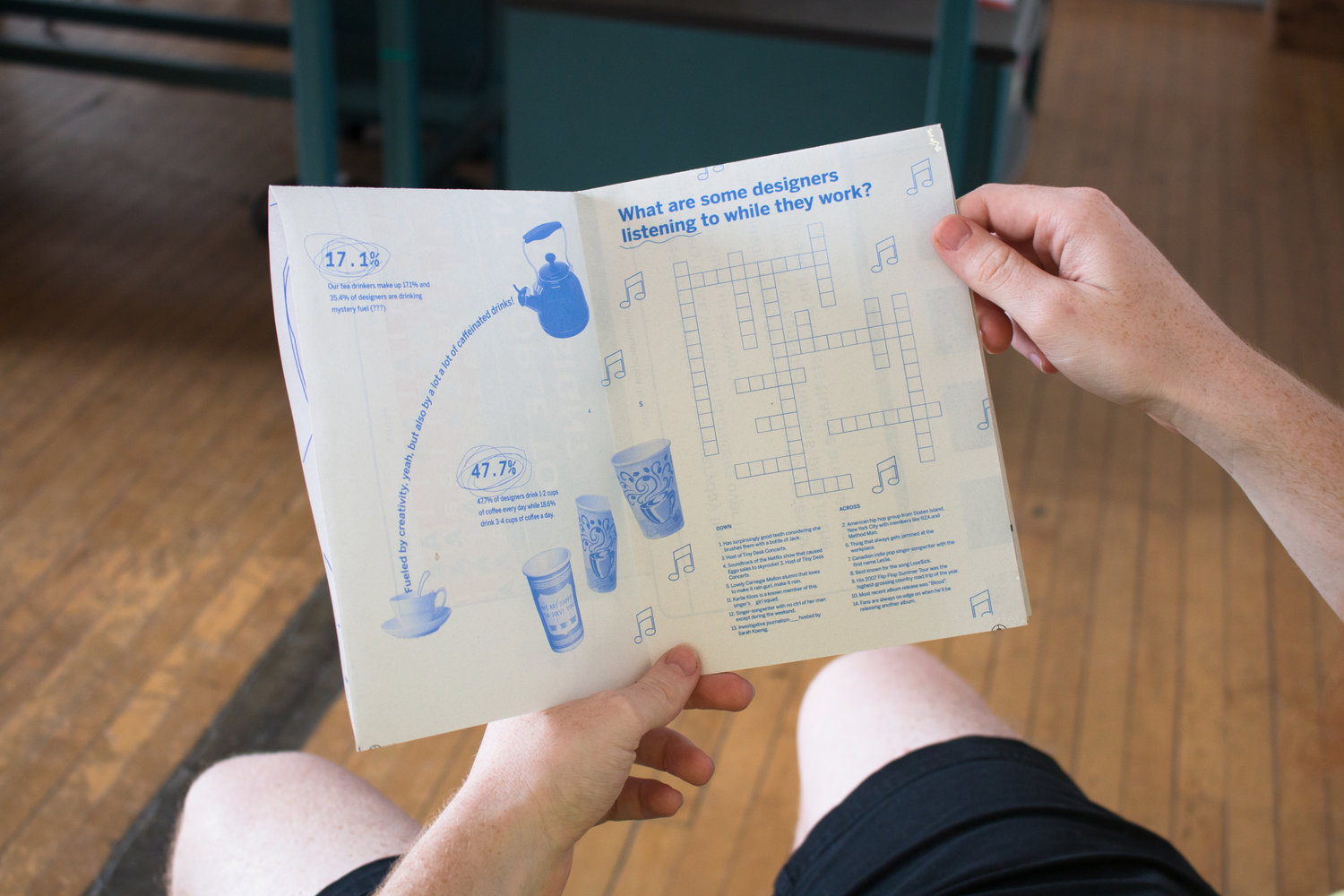
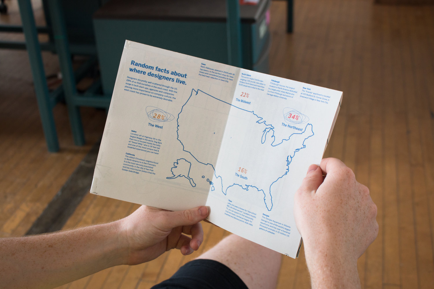
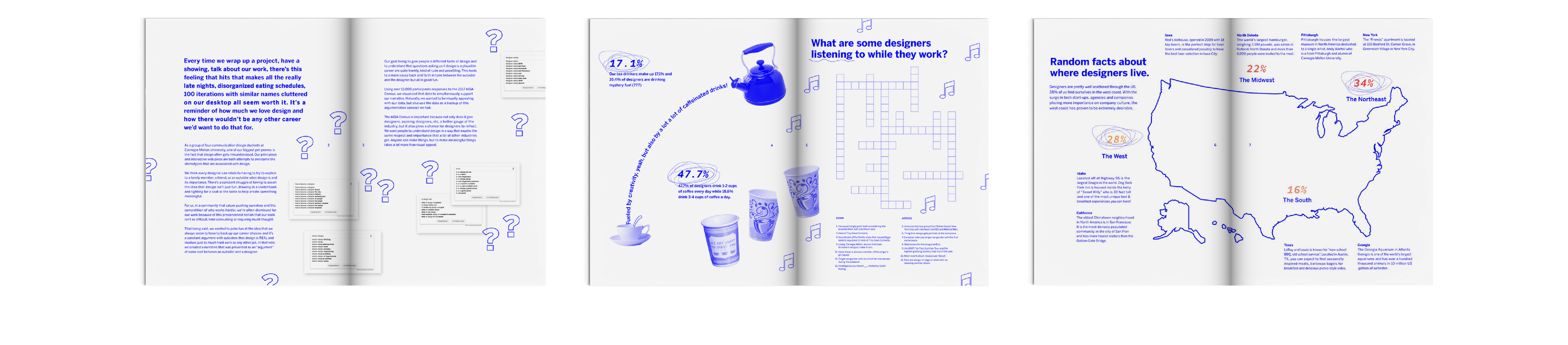
Finally, we created a print piece to round out the project. Our goal with the print piece was to expressly state our intent for the project as well as expand from the four pieces of data from our interactive into some more personal pieces of data. The copy on the print piece addresses how it feels to be a designer rather than only who designers are or what we do and is intended to appeal not only to people close to designers but young people possibly interested in becoming designers.
Caffeine consumption.
Music preferences. (and)
A new take on location.
© 2020 Mason Young-Shor