I created a responsive system for reading stories. In the process, I pushed my creative coding skills in web and app development with new JS libraries, hardware inputs, and a variable font.
I chose to work with stories from The New Yorker fiction section and stated my purpose in recreating the user experience.

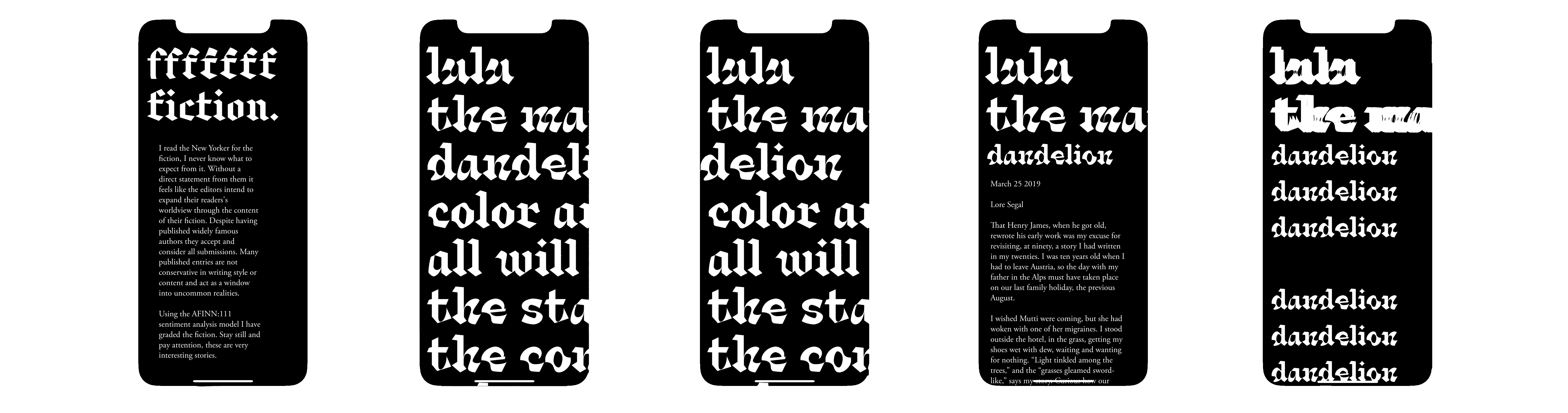
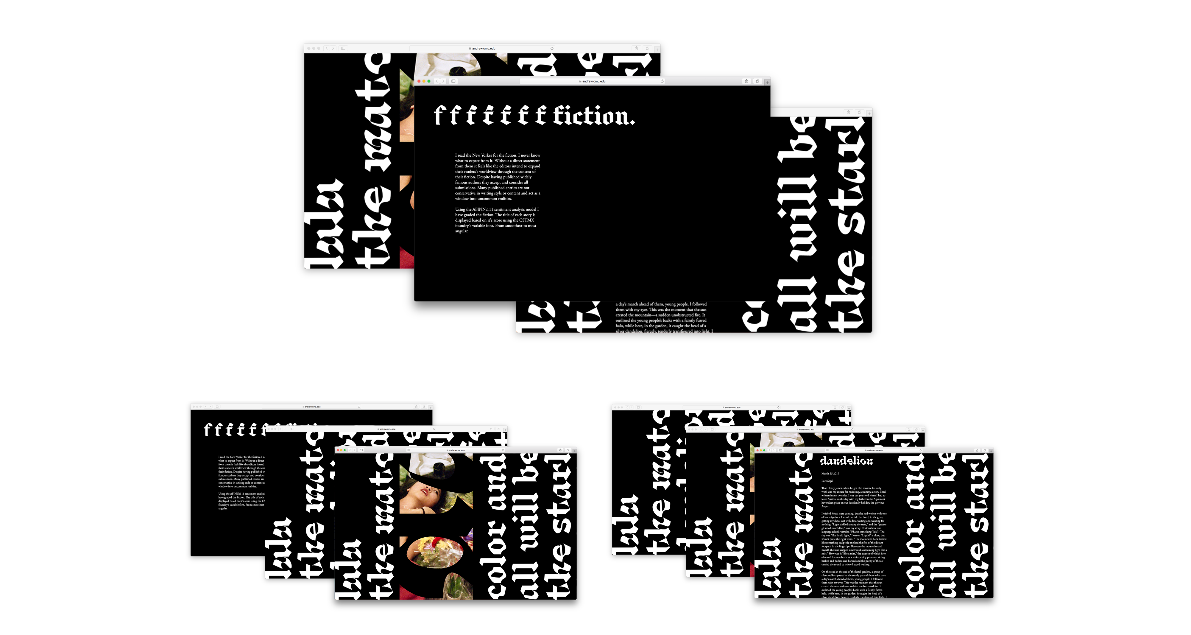
I read the New Yorker for the fiction, I never know what to expect from it. Without a direct statement from them, it feels like the editors intend to expand their readers' worldview through the content of their fiction. Despite having published widely famous authors they accept and consider all submissions. Many published entries are not conservative in writing style or content and act as a window into uncommon realities.
With slightly different statements for each medium based on the different treatments.
Print:
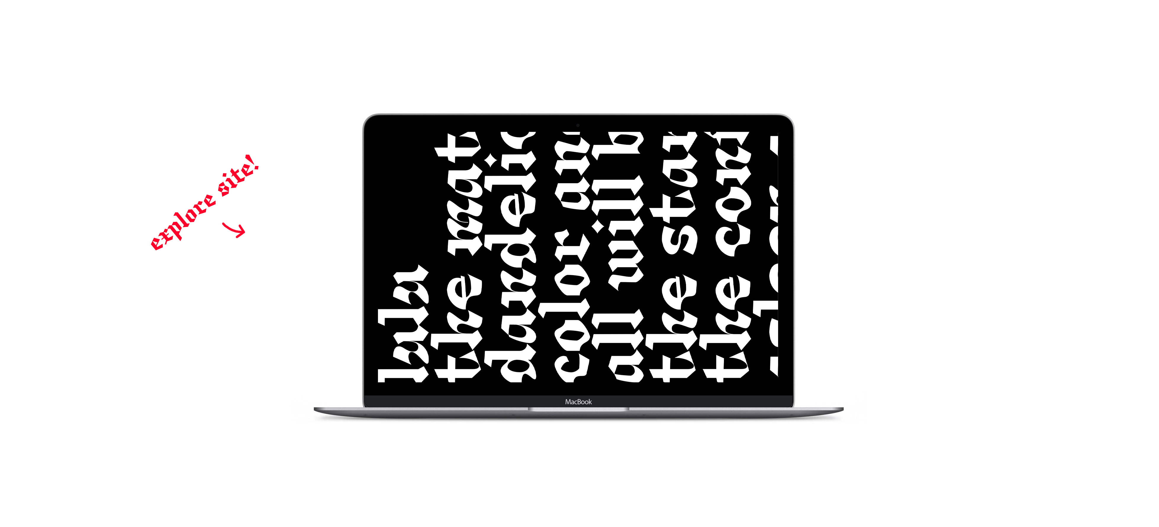
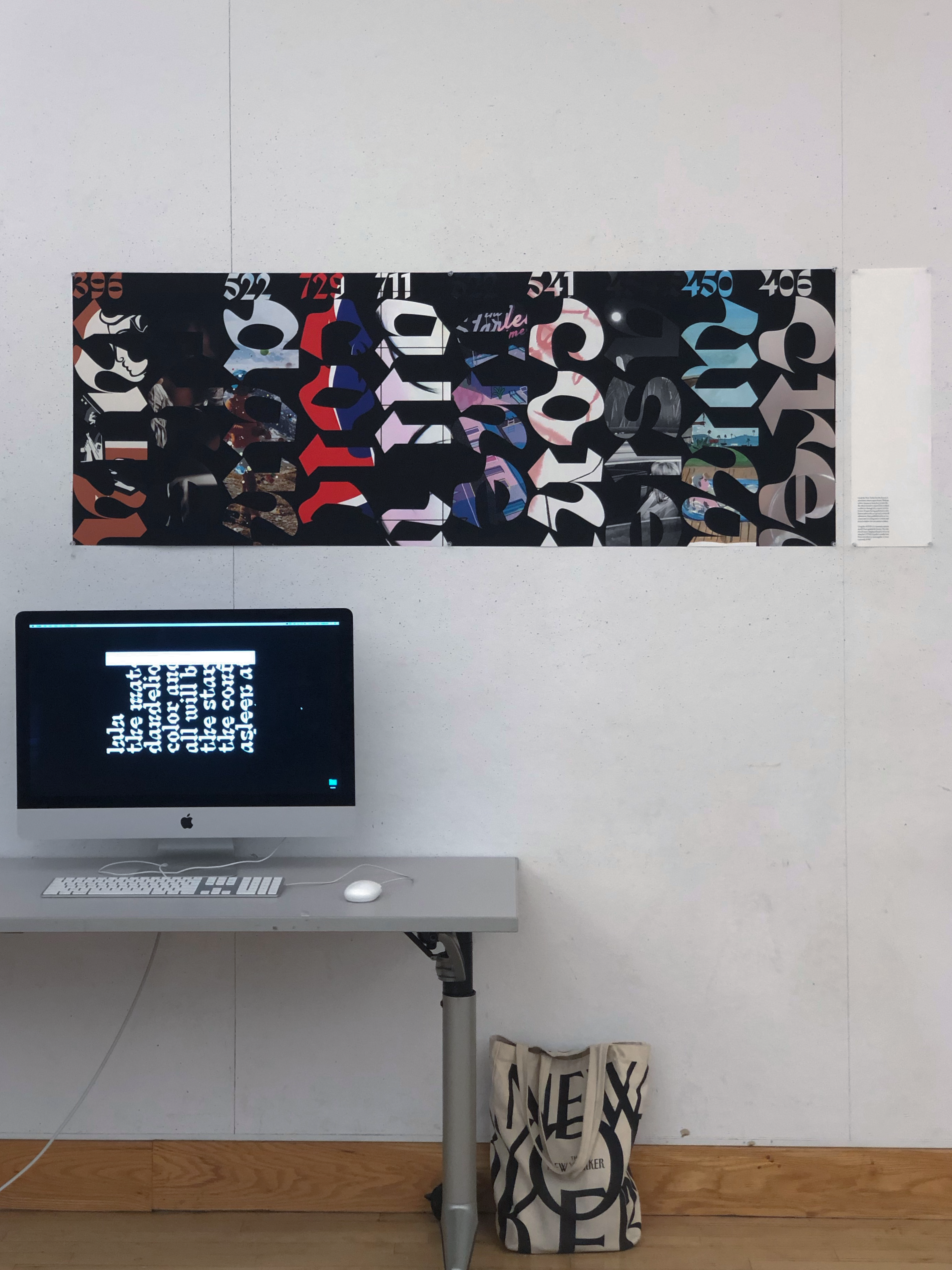
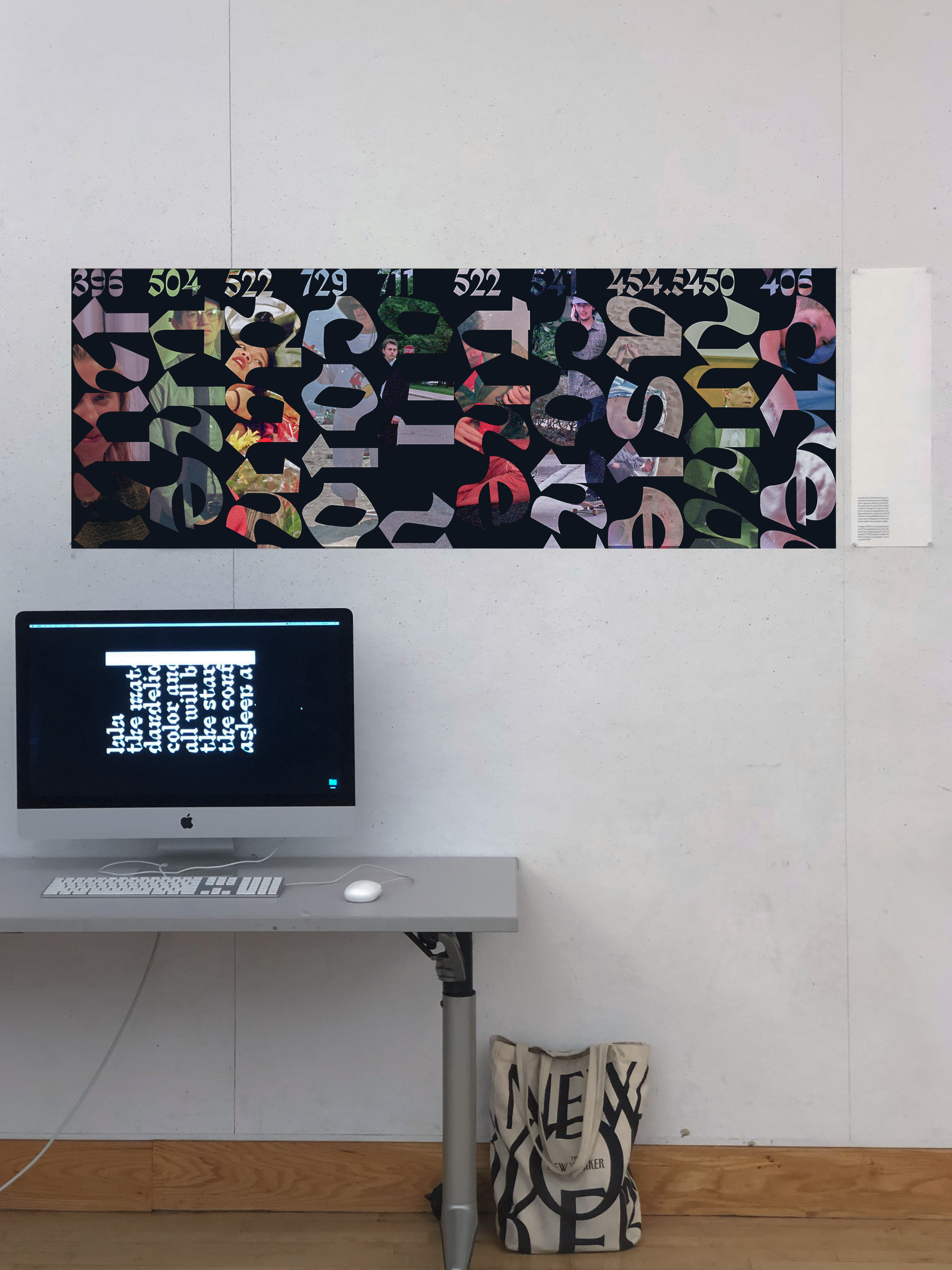
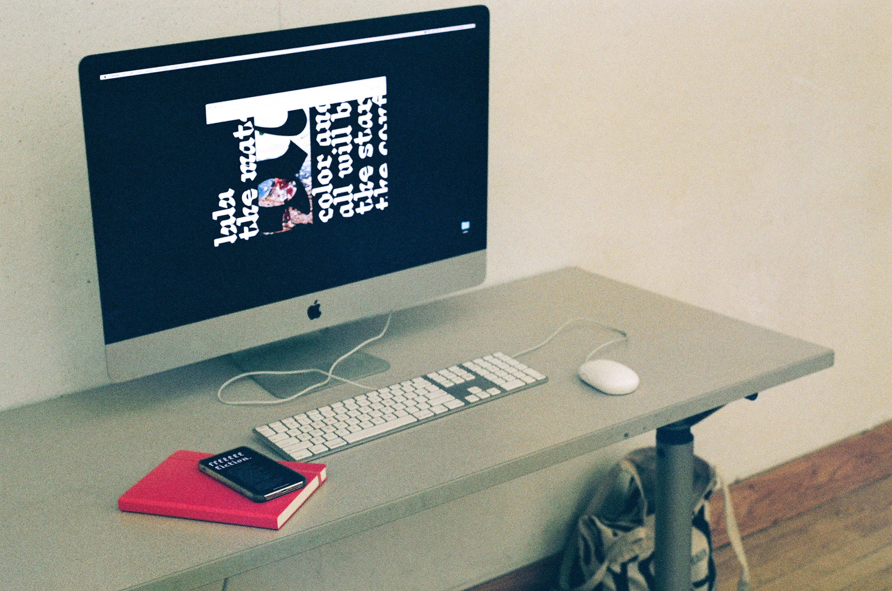
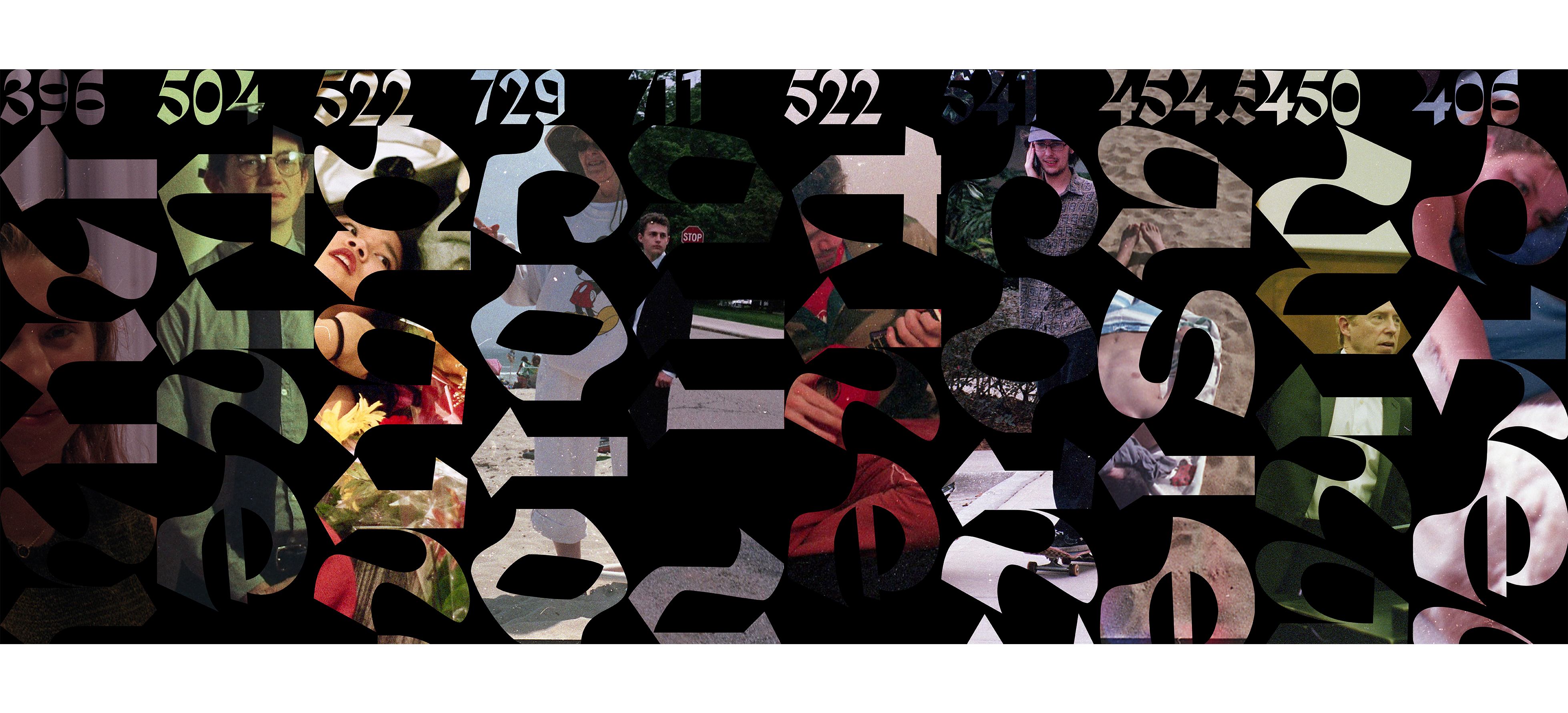
Using the AFINN:111 sentiment analysis model I have graded the fiction. The title of each story is displayed based on its score using the CSTMX foundry's variable font. From smoothest to most angular, or more concretely, 0-950.
Web:
Using the AFINN:111 sentiment analysis model I have graded the fiction. The title of each story is displayed based on its score using the CSTMX foundry's variable font. From smoothest to most angular.
App:
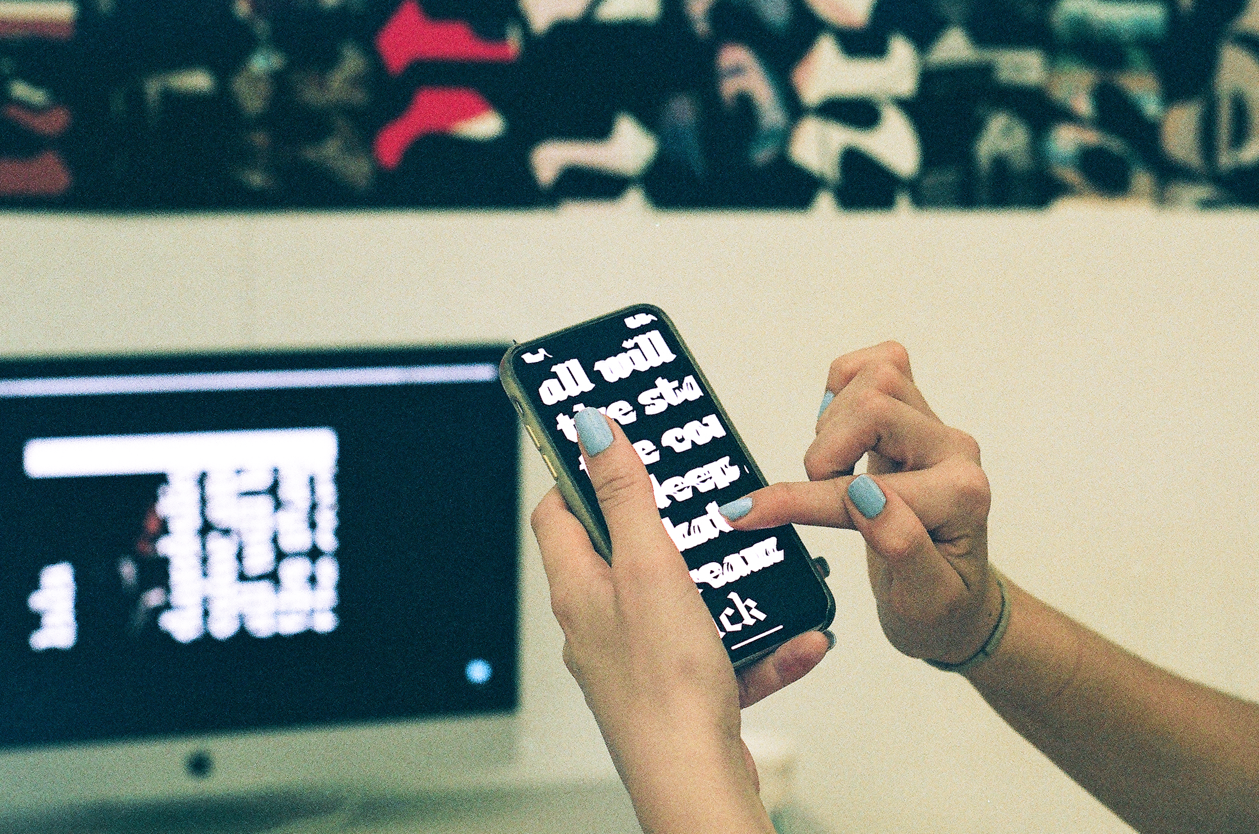
Using the AFINN:111 sentiment analysis model I have graded the fiction. Stay still and pay attention, these are very interesting stories.
My intent was to control viewers attention, I forced viewers to attend to digesting the material they are reading and to consider the nature and sentiment of the text appropriately through each different medium.
In the mobile app I mapped a glitch effect script to the accelerometer, if the device accelerates too quickly the content glitches out of view, forcing the user to be still and attend to the content.
I figured for the desktop version I didn't need to curb the viewers' physical behaviour. I focused on making successful user experience and visually pleasing site that displayed the full story and allowed for viewers to inspect sentiment of the stories, a happy medium between the mobile app and the print piece.
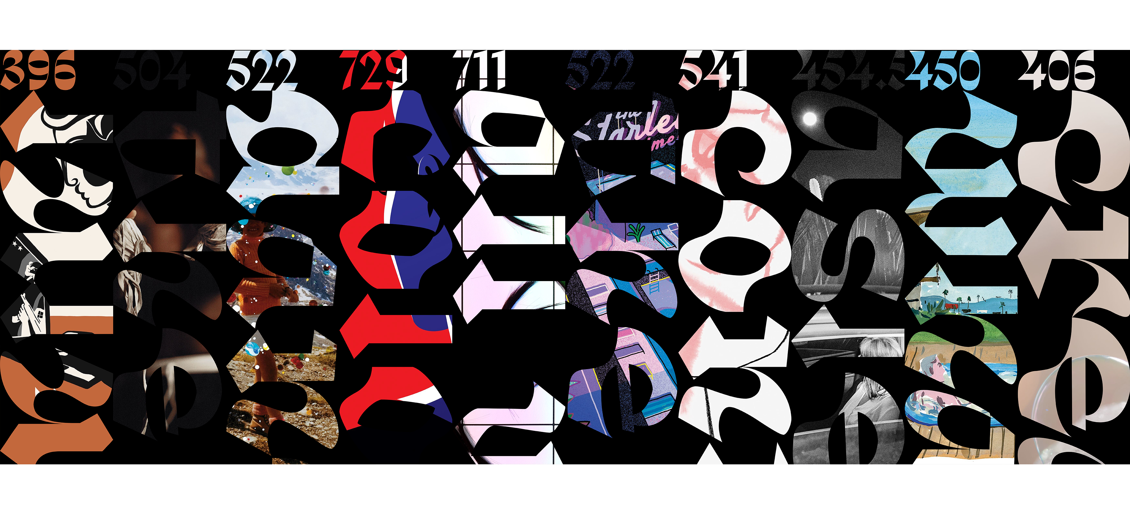
The print piece I designed is intended to focus the viewer on the sentiment of the stories. I chose to display only the title of the stories in their designated version of the variable font as a large scale image mask with their sentiment score at the top.
I initially used the imagery The New Yorker provided for the stories. I decided to use my own images to better balance the poster and similarly represent the stories.
© 2020 Mason Young-Shor