1.
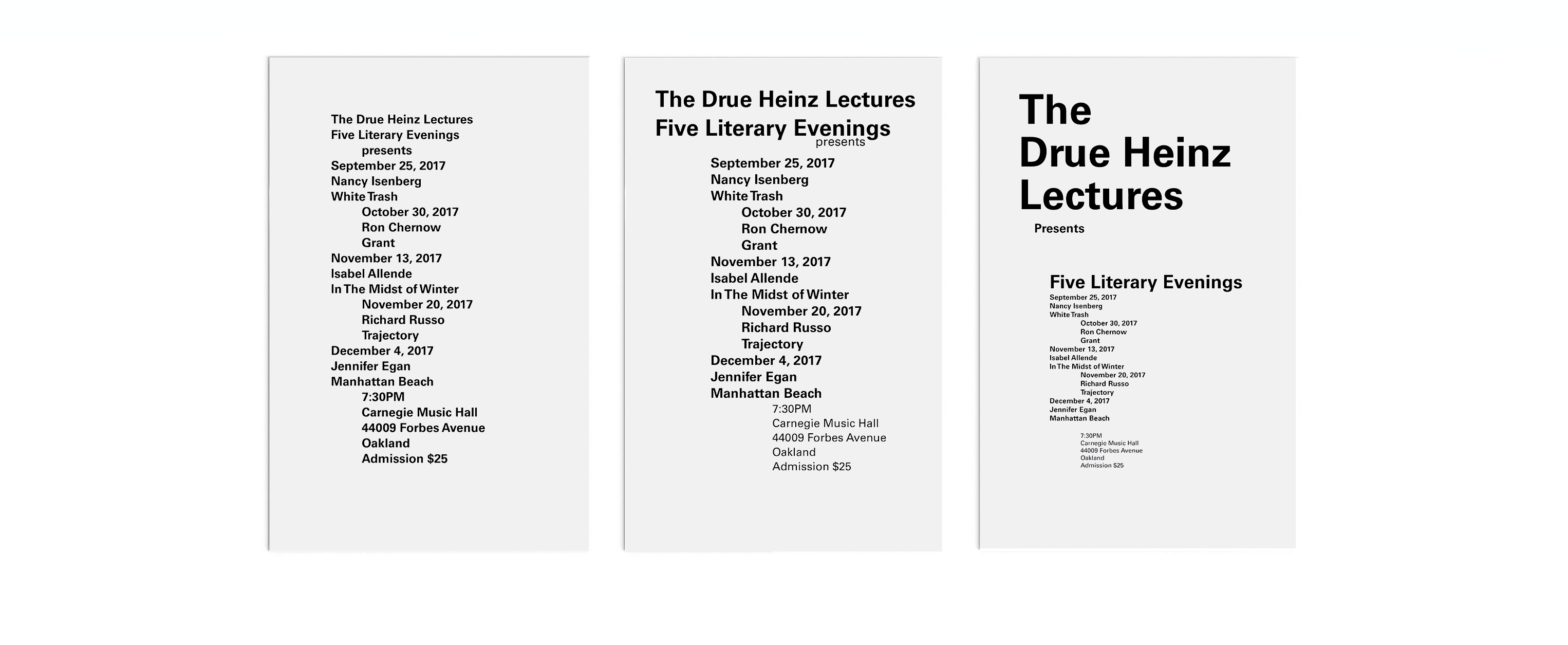
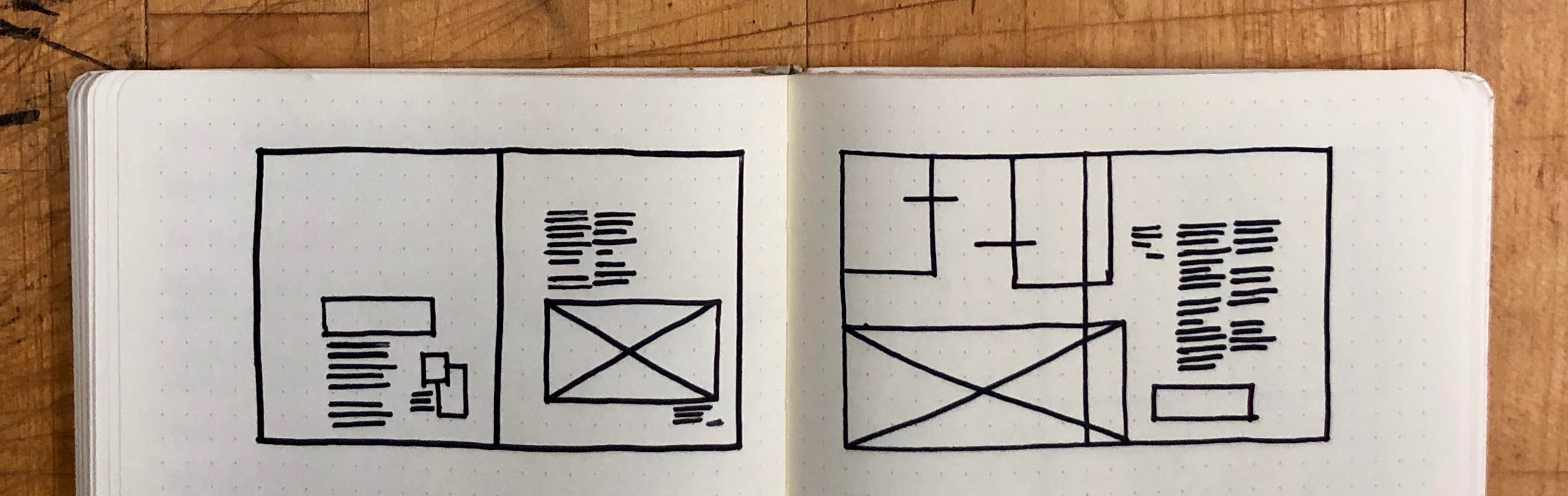
This poster was a formal exercise in visual and informational hierarchy. I started with only text, slowly creating a successful hierarchy by introducing small variation in text size, text height, text weight, and text placement.
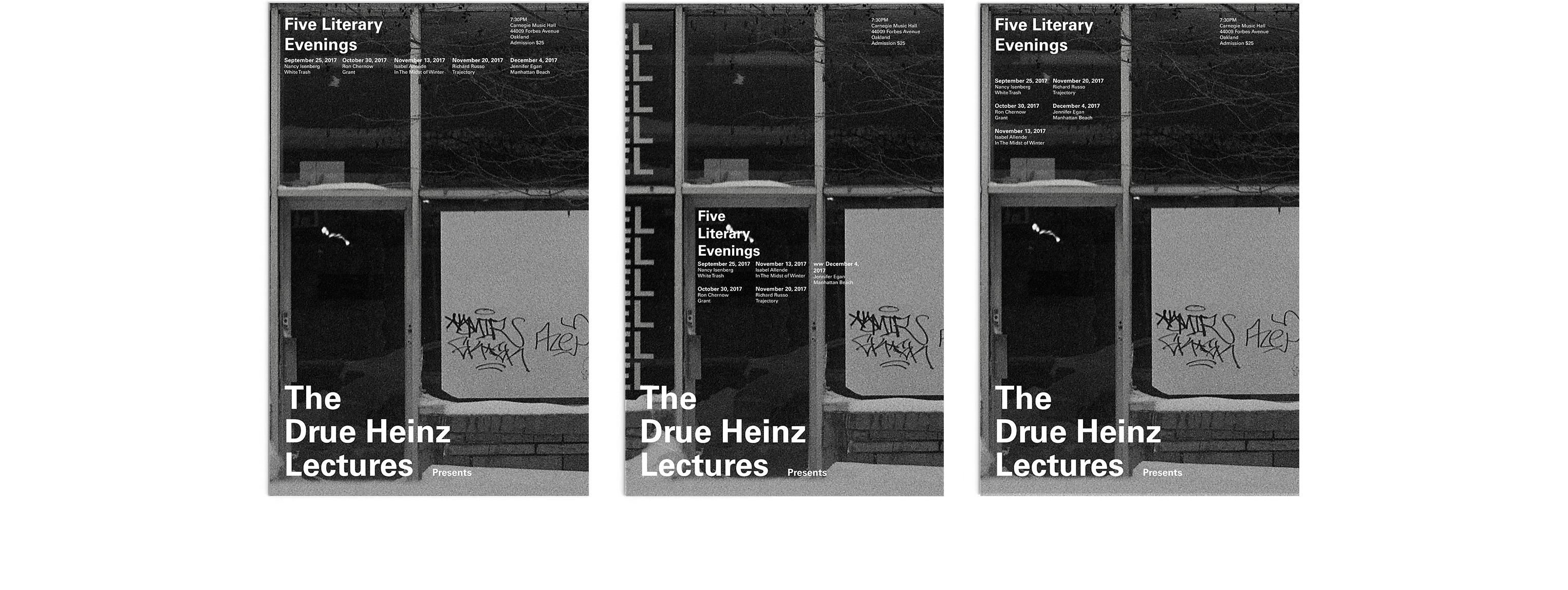
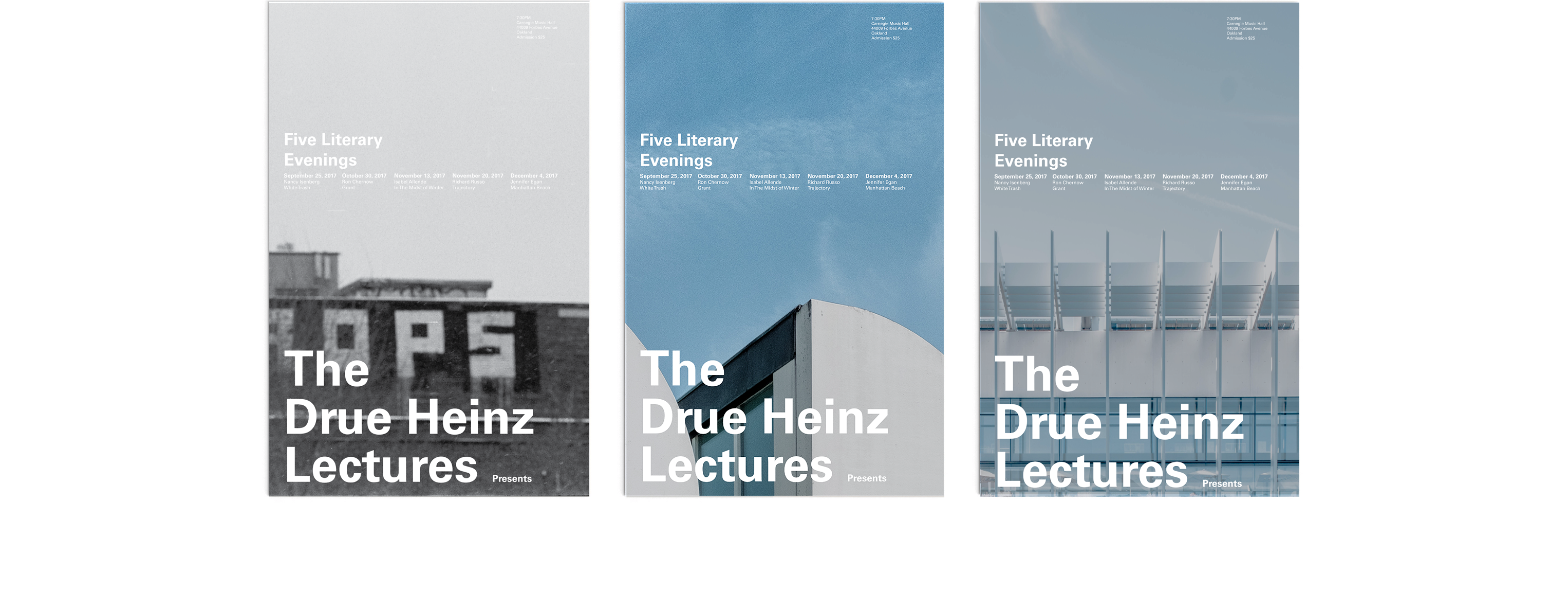
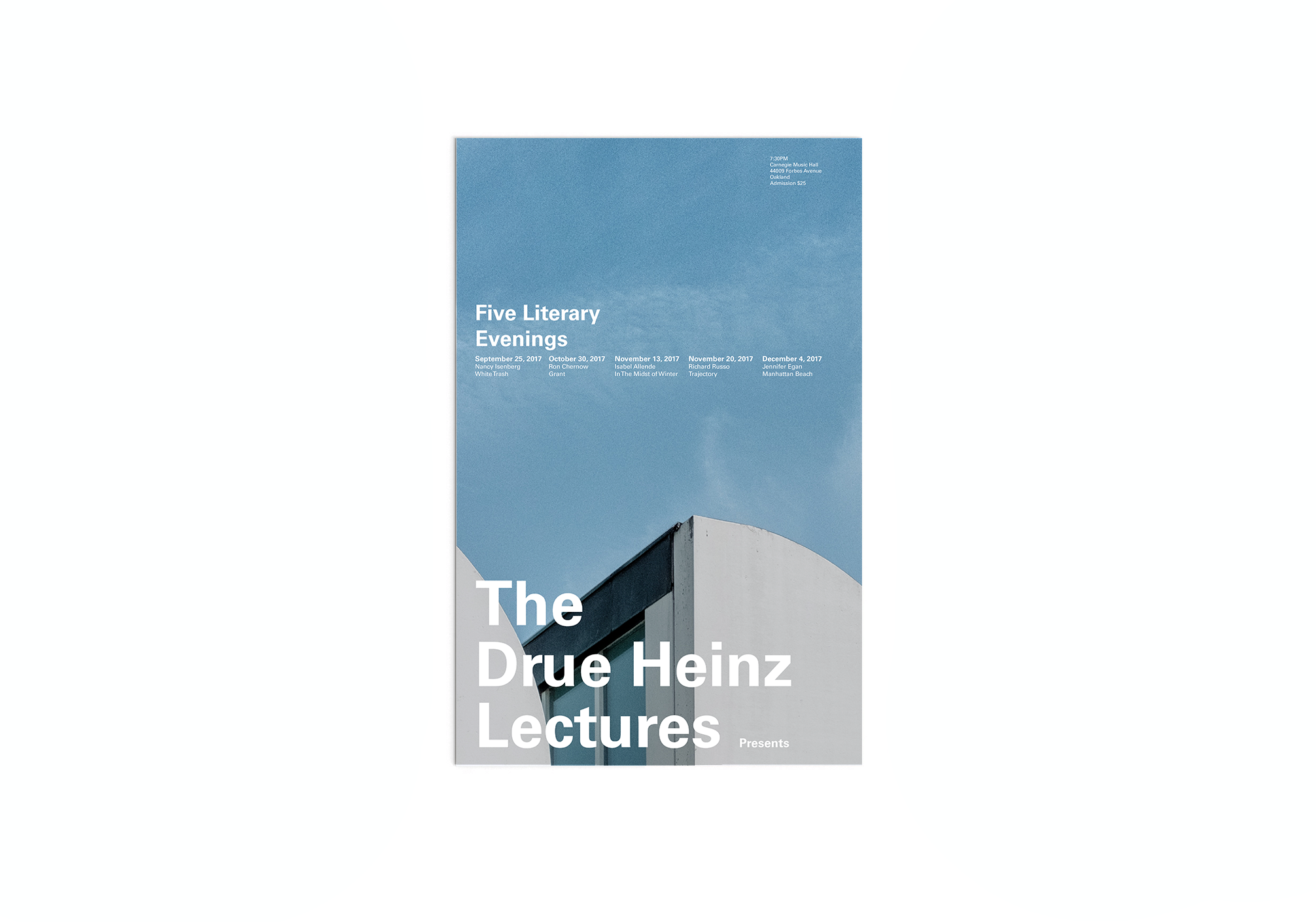
Only after the text was successfully formatted I introduced image, to visually complement the text and content, draw viewer interest, and guide viewer interaction.
This project introduced me to following a strictly guided design process. Following a process acted to combat rash ill considered decision making and fasciliated careful application of design fundamentals in the creation of hierarchy.
2.
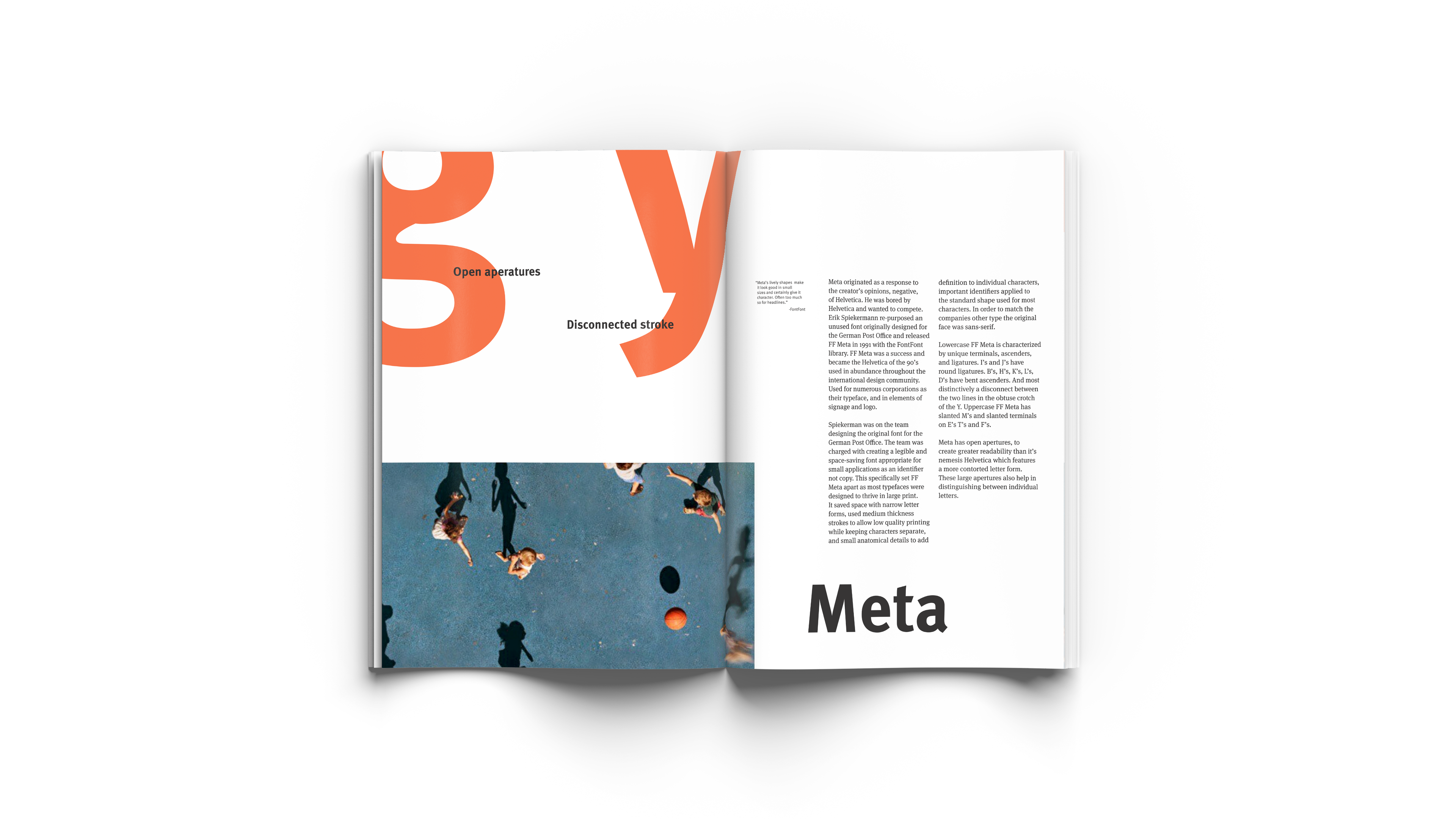
I began my investigation into the typeface Meta by writing a short history and used that to highlight what I found most important about it's story. I formatted the story on a spread using type, hierarchy, and imagery to create an appropriate style and feel to represent Meta both through its content and visuals.
Using type, motion, and sound I created a 45 second animation to accompany the print story. This was an introduction to After Effects as well as a study in the translation and expansion of a project across mediums.
I used the history I had written for the typeface to begin crafting a story and style for the video. I took inspiration from popular examples of use and popular culture durring the typefaces time of creation to create a video that could command an audiences interest while not distracting from important information about the typeface.
This introduction to After Effects was also my first typography project using time. I started becoming familiar with the importance of pacing, movement, and visual + auditory presentation in readability communication and creating audience interest for the video medium.
© 2020 Mason Young-Shor